Technical Documentation: National COVID-19 Situational Awareness Layer (Power BI)
1. Overview and Intent
The National COVID-19 Situational Awareness Dashboard is an interactive, executive-level Power BI dashboard designed for strategic epidemic surveillance. Its primary intent is to convert complex, daily-reported COVID-19 data into a high-visibility narrative.
Unlike raw operational reports, this tool utilizes advanced DAX (Data Analysis Expressions) filter context modifications and a UI layout to immediately surface key performance indicators (KPIs), smooth out reporting noise, and pinpoint geographical hot zones for leadership and resource allocation.
2. Data Model Optimization & Preparation
Before visualizations are rendered, the underlying semantic model is optimized for performance and accuracy.
Key Configurations:
- Auto Date/Time Disabled: Power BI's default hidden date tables are disabled to prevent file bloat and memory drain, ensuring high performance across large temporal datasets.
- Dedicated Measure Table (
_All Measures): All analytical logic is segregated from raw fact tables into a centralized repository, improving model maintainability. - Power Query Data Typings & Null Handling: Columns such as
weighted_risk_scoreandvaccination_rateare explicitly cast as Decimal Numbers. Blank values inherently generated prior to vaccine rollouts are handled vianullreplacement in Power Query, preventing calculation errors downstream. - Geospatial Categorization: The
statecolumn is explicitly categorized as "State or Province" to ensure Bing Maps accurately plots regional boundaries without ambiguity.
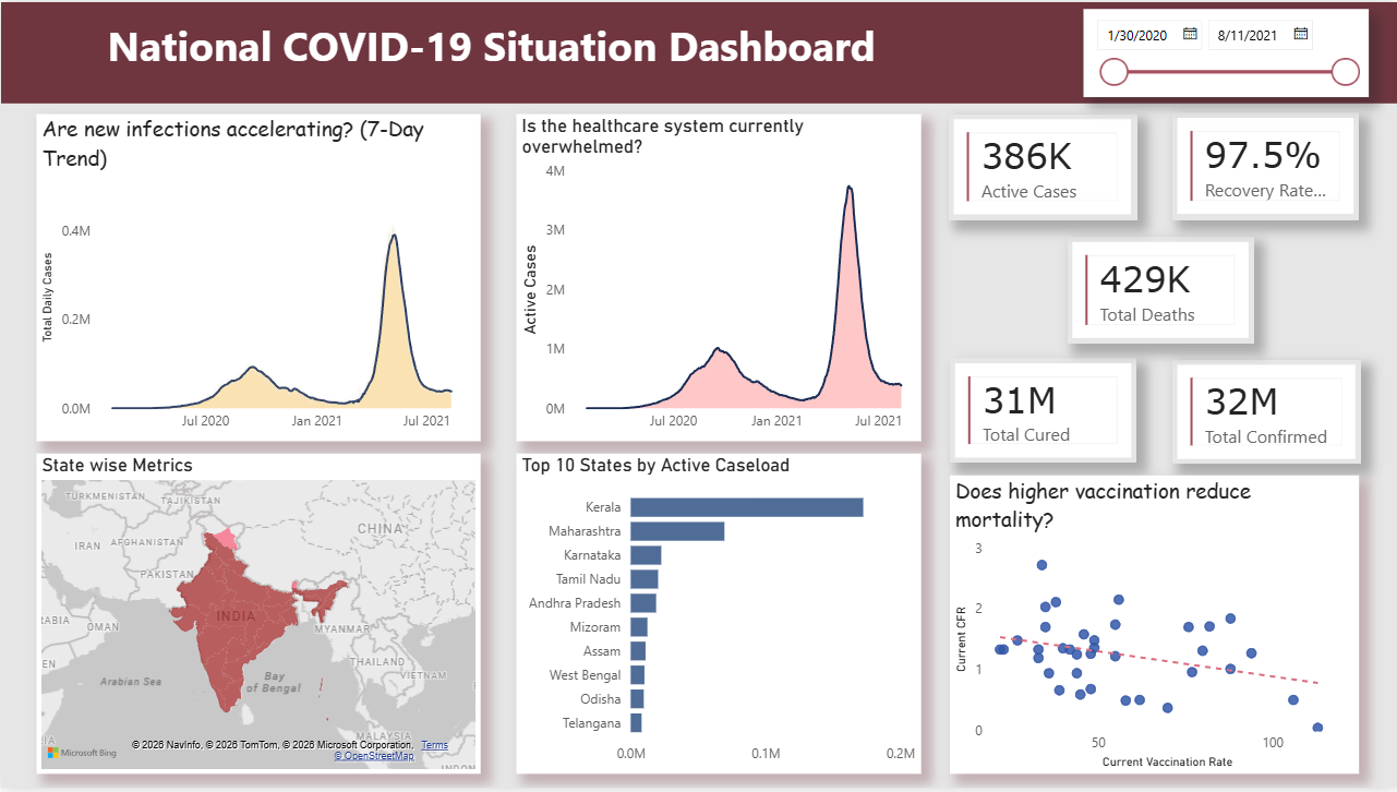
3. National Pulse (Executive KPIs)
Located in the top header, these summary cards provide an immediate national snapshot. The logic is designed to bypass cumulative historical sums and extract only the latest available ground-truth data.
The Formula Logic (Base & Branching):
Total Confirmed =
CALCULATE(
    SUM('covid_summary_clean'[confirmed]),
    'covid_summary_clean'[date] = MAX('covid_summary_clean'[date])
)

Active Cases = [Total Confirmed] - [Total Deaths] - [Total Cured]

Recovery Rate % = DIVIDE([Total Cured], [Total Confirmed], 0)
Technical Explanation:
-
The
CALCULATEfunction modifies the default filter context. By combining it withMAX(date), the engine isolates the absolute latest reporting date in the dataset. -
Dependent measures (like
Active Cases) utilize Measure Branching. They reference base measures rather than raw columns, ensuring that any updates to the foundational logic automatically cascade through the entire dashboard. -
DIVIDEsafely handles potential divide-by-zero scenarios gracefully, returning blanks rather than breaking the visual.
4. Outbreak Velocity (Trend Analysis)
Occupying the middle-left zone, this section calculates the true trajectory of the pandemic, filtering out administrative reporting inconsistencies (e.g., weekend lags).
The Formula Logic (7-Day Moving Average):
7-Day MA =
CALCULATE(
    AVERAGEX(
        VALUES('covid_summary_clean'[date]),
        [Total Daily Cases]
    ),
    DATESINPERIOD(
        'covid_summary_clean'[date],
        MAX('covid_summary_clean'[date]),
        -7,
        DAY
    )
)
Technical Explanation:
AVERAGEXacts as an iterator. It creates a unique list of dates, calculates the total cases for each specific date, and computes the arithmetic mean.- To prevent
AVERAGEXfrom only evaluating a single day on the visual's X-axis,DATESINPERIODoverrides the visual filter context, forcing the engine to look backward exactly 7 days from the current data point, creating a rolling timeframe.
5. Geospatial Risk Mapping & Prioritization
Located in the bottom quadrant, this combination of visuals identifies geographical vulnerabilities.
- Filled Map (Choropleth): Utilizes Rules-based Conditional Formatting tied to a
Current Risk Scoremeasure.- Threshold Logic: Evaluates states dynamically. Scores < 20 (Green), 20-35 (Yellow/Orange), and > 35 (Red). Rules-based formatting is utilized over standard gradients to create strict, indisputable visual thresholds for federal intervention.
- Top 10 States Bar Chart: Provides precise numerical ranking alongside the map.
- Filter Logic: Employs a visual-level Top N Filter driven by the
Active Casesmeasure. This dynamically truncates the dataset to the 10 most burdened states, eliminating visual clutter and negating the need for manual scrolling.
- Filter Logic: Employs a visual-level Top N Filter driven by the
6. Strategic Correlation (Impact Assessment)
Situated in the bottom right, this scatter plot evaluates the macro-effectiveness of counter-measures, specifically analyzing if vaccination strategies are actively reducing mortality.
Component Configuration:
- X-Axis:
Current Vaccination Rate - Y-Axis:
Current CFR(Case Fatality Rate) - Size: Weighted by
Total Confirmedto accurately reflect population density impact. - Analytics: An automated dashed Trend Line is overlaid to expose the statistical correlation (negative slope indicating successful vaccine efficacy).
7. UX, Layout & Interactivity
To ensure maximum usability for non-technical stakeholders, the dashboard employs specific UX protocols:
- Z-Pattern Layout: Guides the user's eye naturally from the high-level summary (Top) to chronological trends (Middle) to granular geographic details (Bottom).
- Cross-Filtering: The underlying semantic model supports native, bidirectional cross-filtering. Selecting a specific state bar immediately isolates that region's metrics across the Map, KPI cards, and Trend charts.
- Global Date Slicer: A responsive timeline component in the dark header pane that instantly recalculates all measures and context limits, allowing stakeholders to easily isolate historical waves.
- Extended Tooltips: Hover states are enriched with secondary data points (e.g., Active Cases, Vaccination Rate) via the Tooltip well, maximizing data density without congesting the UI.